About Painting
I began painting a bit late in respect to the environment I was raised in, with my father's paintings all around me as far back as memory can take me. I did not pick up a brush until about age 20, so I've painted, at times only on or off, for over 35 years. And though I was widely regarded as an artist, I never really felt myself to be an accomplished painter or even happy with my paintings for the bulk of that time. Up until about ten or eleven years ago, painting was never really enjoyable or therapeutic, but rather frustrating. I failed to come across anything inspiring enough in a consistent, understandable way to light a true path. And then I came across some paintings that sparked something inside me very acutely, and I knew that was how I wanted to paint and the images provided a vehicle by which I felt I could get there that was tangible, recognizable, and learnable, and therefor, now also teachable. Besides what you'll find on these pages, there are more examples in the blog.
If you'd like to take a side trip and read about my own art education, or lack thereof, as well as my father's very formal old world training click here
If you'd like to take a side trip and read about my own art education, or lack thereof, as well as my father's very formal old world training click here
The Basics
In order to reproduce an image. one must first be able to see. By saying be able to see, I mean developing an understanding what patterns of light the eyes are sending to the brain to be interpreted as visual representations of reality. Without light, one sees nothing. Darkness is always the background light paints upon. And without the contrast of darkness, light would have no meaning. In other words, all things are visible only from the darkness they emerge from, shaped by the light that illuminates them.
If everything on your canvas is light and pastel colored, it's hard to define any one thing as being bright, since contrast is lacking. Without contrast, the surroundings rob that object of its brightness.
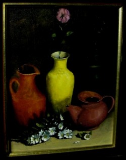
I would say that one of the most common flaws in painters' experience that creates problems unknowingly, is that the overall pitch, or tonality, of specific objects is too high. That is, most beginning painters overestimate the lightness of their midtones, making it difficult to establish effective highlights. For example in the image on the left below, it might seem that the two pots on the sides need to be lightened. But in the image on the right it can be shown the highlights are all that are needed and they are more effective because of the lowered midtones.
If everything on your canvas is light and pastel colored, it's hard to define any one thing as being bright, since contrast is lacking. Without contrast, the surroundings rob that object of its brightness.
I would say that one of the most common flaws in painters' experience that creates problems unknowingly, is that the overall pitch, or tonality, of specific objects is too high. That is, most beginning painters overestimate the lightness of their midtones, making it difficult to establish effective highlights. For example in the image on the left below, it might seem that the two pots on the sides need to be lightened. But in the image on the right it can be shown the highlights are all that are needed and they are more effective because of the lowered midtones.
 |
 |
Color Contrast

The two basic kinds of contrast are light and dark, or tonality, and color, or hue. There are few exceptions to the general rule that most materials are made up of a range of both hues and tonalities rather than a single color. Generally, except in extreme conditions of intense color in bright light, colors need their neighbors and even opposites to work well, in a mixture of both subtle and not so subtle ways. In the detail of a portrait at left, it is clear to see a fine articulation of both hue and lightness. The vehicle is mainly the interspersion of the warm tones, from the red violet to orange on the left side of the chin to the gradual intermixing of the warm tones with the blue and green (on the opposite side of the color wheel) on the right side of the chin, under the lower lip, and actually all throughout.
This is done as an actual mixture initially just by the act of painting wet on wet. In case the painting proceeds to layering, the effects can be more articulated, which works better in the case of a man's chin than a toddlers, but some small scale working is nearly always more effective than overblending a large surface. By layering I mean the paint is allowed to dry and then painted over in varying degrees of glazing and opacity, allowing for a much greater attention to detail in all contrasts, since the paint doesn't get muddied or contaminated by paint beneath is.
This is done as an actual mixture initially just by the act of painting wet on wet. In case the painting proceeds to layering, the effects can be more articulated, which works better in the case of a man's chin than a toddlers, but some small scale working is nearly always more effective than overblending a large surface. By layering I mean the paint is allowed to dry and then painted over in varying degrees of glazing and opacity, allowing for a much greater attention to detail in all contrasts, since the paint doesn't get muddied or contaminated by paint beneath is.
An obvious and extreme use of color contrast is this tiny painting of penguins below. I used the two extreme opposites that also suggested cold and warmth well. Note that the orange hues are interspersed throughout the basically blue ice, that the red sky has more articulated blues throughout, and the penguins themselves are basically white and black but at the same time reflecting all the colors around them, and, with black accents, use the same color contrast as their surroundings.

