Color Suggestions and Shortcuts
Any color at all can be made with blue, red, yellow, and white or black. In the world of pigments, one would have to find the purest instances of these colors for this to actually be true. In reality, it may not be the case that such pure pigments exist. It is possible that Grumbacher red is the closest to pure red, but how pure is it really? What is a pure blue? Not Prussian Blue, certainly, or Ultramarine. What is a pure yellow? Cadmium Yellow Light? Lemon Yellow?
It is for this reason that even though a painting can be done using only those primary colors, it seems certain colors are difficult to reproduce in this fashion. The most obvious example that comes to mind is the use of violets. It is difficult if not impossible to create violets from any available red and blue that is as pure and vivid as the various violets prepared by the manufacturers.
All the various colors we place on our palette are convenience colors designed to simplify the process. As there is no one approach to achieving desired effects, the following color combinations are suggestions to experiment with as I've found them to be good shortcuts. The key in each case is the proper proportioning and how this proportioning varies from one spot to the next on canvas. Those are things I can't specify for the most part. That is where an artist's feeling comes into play. You should be able to distinguish a silver vase from one made of pewter. You should be able to tell bronze from brass or copper. This won't be a complete list, but here are some materials and color suggestions for helping to achieve convincing effects. Keep in mind, there are many substitutions. Listed are the colors I happened to have on my palette. Although not identical, for example, Red Rose and Alizarin Crimson could both be used to the same end.
Apple, Red and Green
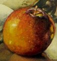
Midtone shadows and transition--Thio Violet, touch of black, Grumbacher Red, Red Rose or Alizarin Crimson.
Light tones-- Cadmium Red Light, Cadmium Yellow, touch of Permanent Green Light.
As can be seen, not all of these are mixed together, but vary from point to point. Look at your subject. See the reflections. Observe light and shadow.
Light tones-- Cadmium Red Light, Cadmium Yellow, touch of Permanent Green Light.
As can be seen, not all of these are mixed together, but vary from point to point. Look at your subject. See the reflections. Observe light and shadow.
