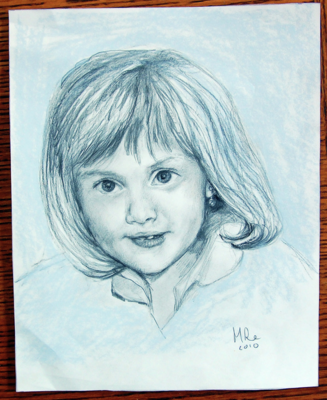
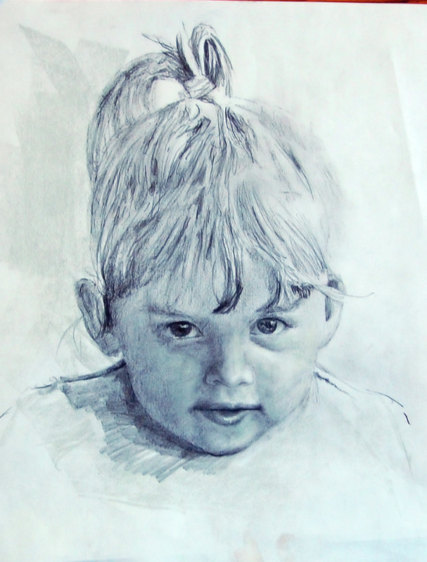
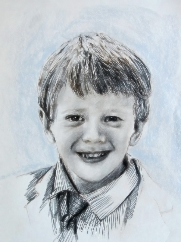
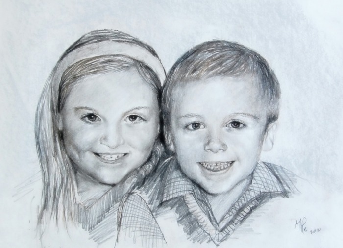
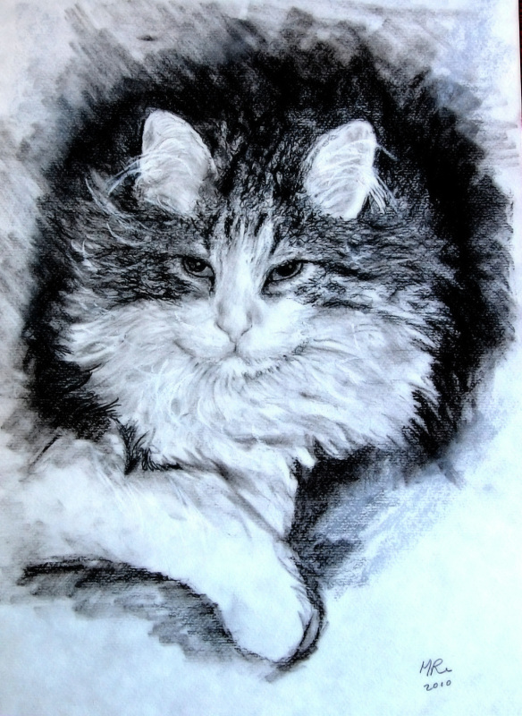
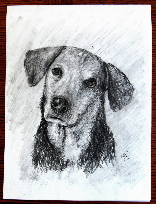
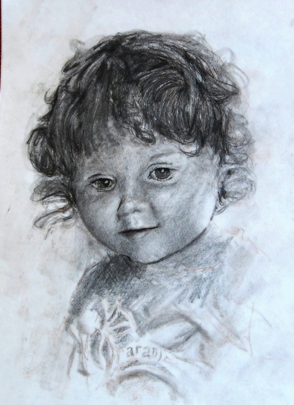
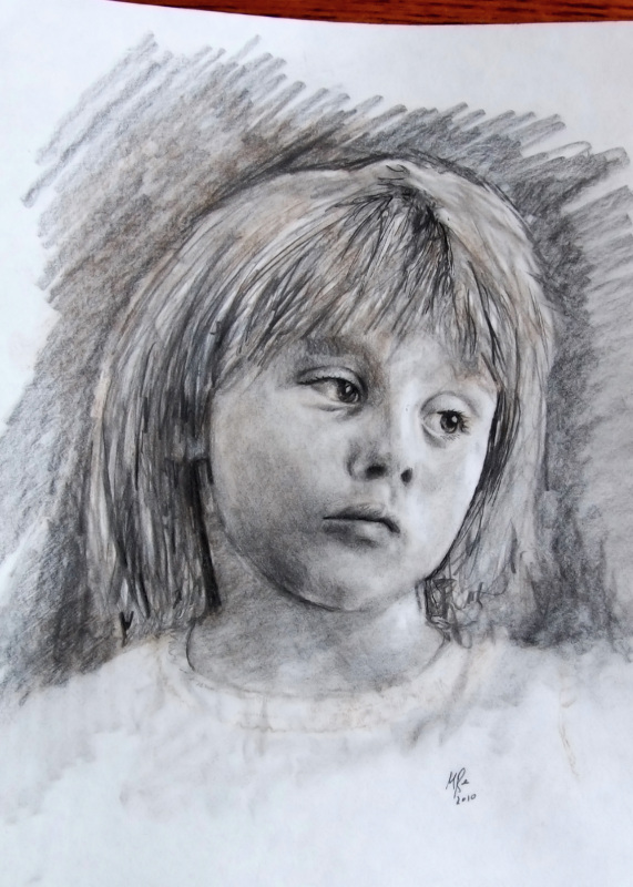
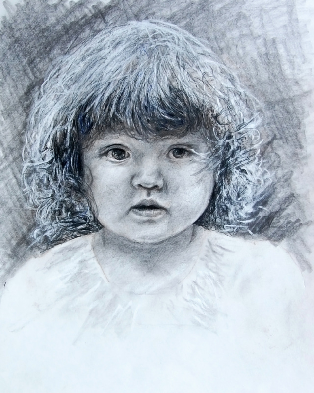
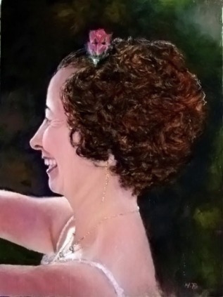
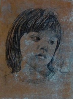
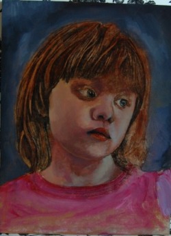
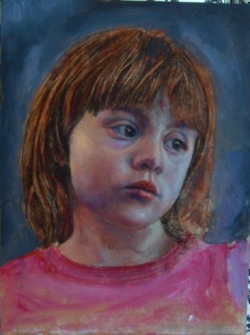
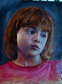
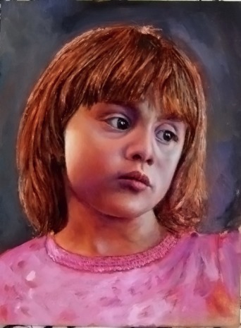
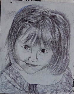
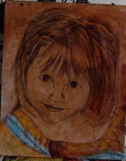
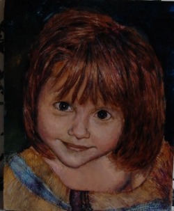
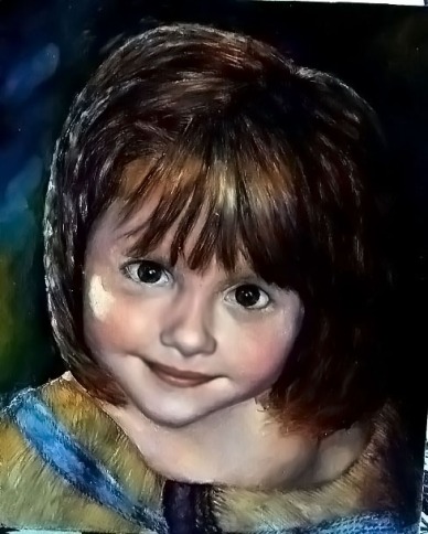
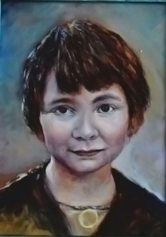
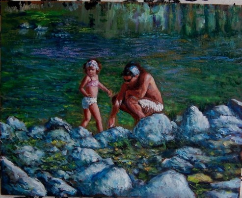
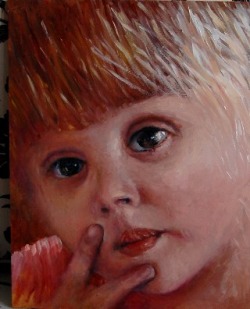
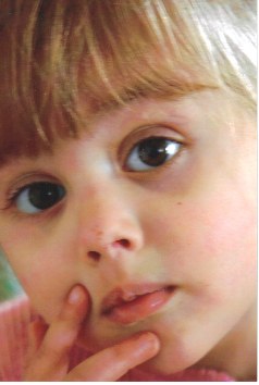
Well, that was the concept. Small, relatively realistic portraits in whatever medium I chose to use to accomplish a decently detailed, usually pencil and ink based drawing. Something that might be accomplished reasonably in a short time frame, but still sacrificed little.
1 Comment
![]() As before, I started with a more or less detailed sketch in pen and ink using a Faber-Castell PITT Artist Pen with an Extra Super Fine .01 mm nib.I left the neutral mottled background of the panel rather than painting it over before starting the drawing. That background color came about accidentally as a result of the HDO panel's (high density overlay plywood) prior use as a form base for some architectural cast stone production use. ![]() Early colors used were neutral tones in magenta and purple neutralized with Raw Siena and/ or Yellow Ochre. At this point I'm only interested in covering all areas of the panel with a beginning base of color, and establishing only basic areas of tonality (relative brightness), and very basic color temperature. The right side will have a cool source of light and a warm source will spring from the left. ![]() In the next step the cool tones on the right side were slowly built up using Naples Yellow and Cerulean Blue and white. The left side was kept subdued but slightly warm, using various neutral reds like Burnt Siena and English light red neutralized by a Dio Purple where necessary deeper in the shadows and, in the lighter transitions, Cadmium Red Light and Naples yellow, becoming more intense where the small area of direct sunlight will evolve. ![]() In the final stages nothing really new is introduced; just the smoothing of transitions and a continued slow build up in the intensities in the lighter areas. The direct sunlight on her right cheek (our left) is defined more purposefully. The tonal transitions are “smoothed”, not by overblending, but by braiding and interweaving complimentary and contrasting hues (such as orange with violet) that are tonally similar (same brightness value). ![]() The lighting scheme here is from dual sources, a cool light coming in from the right and a warm direct sunlight type light from the left. Since the two light sources are contrasting hues and temperatures, this can make for a an interesting mixture of color contrasting reflections in the face, for example, both cool and warm reflections under her right eye (viewer’s left). Many portraitists have detailed procedures they follow that can be very time consuming. Obviously, they feel the extra steps are worth it. I guess my patience limits how far I’ll follow that path. Lately I’ve been playing with a process I never used before while realizing it is only one of a nearly limitless number of choices. I figured I would illustrate it for what it is worth without suggesting that it is the definitive way to paint a portrait. I began with a careful black and white pastel for the purpose of being sure my proportions and details were correct to my understanding before using paint. Over that I applied a pen and ink drawing. Some of this will show through the final painting imparting a graphical quality (maybe) and other parts will be deeply covered. ![]() Step 1 drawing ![]() Next, a glaze of mainly Raw Siena and Van Dyke Brown in oils mixed with Liquin, which is photo 2, is applied to most of the panel. ![]() Staring on the flesh tones next, I choose a white, Naples Yellow, a touch of Cadmium Red Light and a touch of Cerulean Blue to cool. Of course the proportions determine the actual outcome and it has to be felt since it varies continuously. The fact is there are an infinite ways to approach it and basically my choice of colors with which to start,was almost arbitrary and on the too simple side, and will look rather one dimensional at first. Into this initial covering I mix into (as opposed to ‘apply over’, as it is still wet) various complimentary color harmonies, along the lines of orange, pink, light blues and magenta and violets.. This is the part of the process I have been trying harder to track as I’ve never been able to describe it in discreet logical steps. But I’ve pretty much failed again because those color choices seem to be made on the fly, adjusting the color temperature continuously. One can only do so much at this point, being careful not to overmix on the panel in order to avoid muddying up the hues. I’ve also chosen a dark background and applied white ink to the hair highlights. This is possible because of he use of Liquin which accelerates the drying time. Photo 3 at the end of this process. Now the painting will dry somewhat overnight. ![]() After continued work towards luminosity, building it up gradually rather than trying to achieve it instantly with simpler but more one dimensional color schemes. I'm trying to jump around the color wheel a bit from yellow to violet, working them among each other, gradually building a deeper and subtler luminosity. Everything up until now has been wet on wet, i.e, no chance to layer much since the first layers are still wet and trying to layer is still a squish on wet paint proposition. Further progress must wait until after vacation. Unless I want it to end wet on wet. Here it is at 9 hours. Hate this photo. I'll take another when we get back. No time left now.
Today's Wednesday. Tomorrow I'm off to California to visit my son and his family, including their gorgeous daughter whose portrait you see on the left of the banner above.
We'll be heading out for a nice stay at the beach after that, so I won't get to post (or even work, for that matter) for several weeks. But I thought I'd start the day by documenting a small portrait of my other granddaughter, Sophia. So this one's going to be a bit atypical, because Sophia's face is closely cropped in the photo, and I thought the painting might be interpreted in the same way. Anyway, here's the photo I'll work from. |
Archives
October 2018
Categories
All
|